


This article originally appeared in the July 2018 issue of Resource Recycling. Subscribe today for access to all print content.
Smart cities, IoT, Big Data, Blockchain. These buzzwords sit at the heart of the digital revolution that seems set to change the way cities and their inhabitants operate.
But though those innovations certainly hold enormous potential to reshape the efficiency quotient of basic services, the fact remains that most municipalities aren’t taking full advantage of the resources and data they have available already.
In other words, before we try to integrate and digest the massive data sets to come, we might want to make sure we are actually utilizing the numbers that have been at our fingertips for years. If nothing else, municipal leaders should at least know the current possibilities.
This article will explore some program enhancements that can come through simple – and smarter – data organization.
Finding per capita generation
At a basic level, all waste data is measured the same way – by weight and by geographic area – and it’s already suited to give you some of the major insights you need.
Let’s take an example: It’s Monday morning, and you have 10 trucks going out to hit all 10 of your Monday recycling routes. These routes have been in use for a few years and are completed by either hitting certain streets around the city or covering a defined zone. Usually, they’re built to contain a certain number of stops – maybe 800. Your drivers know the routes by heart, but they might keep paper maps in the cab just in case they get pulled to a different route, or perhaps just to annotate as they go. Once they’ve finished the assigned route for the day, they’re off to the materials recovery facility (MRF) to dump their load and then head back to the yard.
This scenario gives us all of the localized data we need to compute a very valuable data point – average per capita recycling generation – for each of those 10 recycling routes and, by extension, the city as a whole.
Let’s break it down. When your recycling collection trucks tipped at the MRF, they generated a weight ticket. Sometimes this is a physical ticket that gets turned in as part of a driver’s daily routine, and sometimes it’s generated electronically. Electronic is easier, but either way we can get to where we want to be from a measurement perspective.
Take each of those 10 or so weight tickets, and mark the route that was run on them (in this example, let’s say the routes are M1 through M10). Next, find out how many total stops are included on each of the routes (not just participating houses). This could be determined from the number of stops originally assigned to each route. The number could also be determined via a physical thumb counter utilized by each driver. Or perhaps an electronic counter is located on the truck arm.
Once you have the total stop number, as well as the average household size in your city (found via the U.S. Census), you can compute the following formula:
Total M1 Route Tons ÷ M1 Stops ÷ Avg.Household Size × 2000 = M1 Lbs per Recycling per Person
Now, repeat that formula for each of the nine other routes. You now have per capita recycling generation for each of your 10 routes for that date.
When Tuesday comes, do the same thing again. And repeat through the end of the week. You now have one week’s worth of per capita recycling generation data for the whole city.
I’m guessing a lot of you already do some version of this, and you might even have a spreadsheet to graph each of the routes over time. Unfortunately, just looking at numbers on a spreadsheet doesn’t always give us the insight we need. Sometimes we need to visually pull the numbers together, which is where the concept of geographic measurement comes into play.
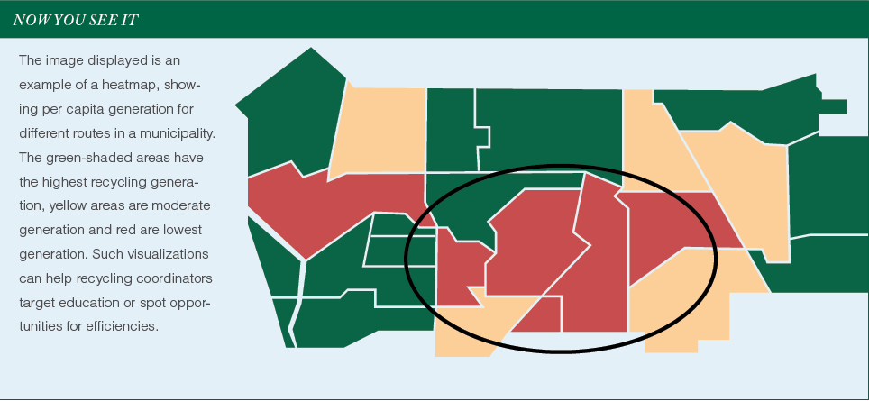
Feeling the heatmap
Take all 50 of your routes – assuming 10 per weekday – and draw them on a map (mapbox.com is a nice tool for this). Take your week of data, pull out the 17 routes with the lowest pounds per person, and color those routes red. Take the next lowest 17, and color them yellow. Then color the remaining routes green.
You’ve just created a “heatmap” of your city, showing exactly where different levels of recycling generation are taking place. Clearly, this is a rough calculation and it’s just one week’s worth of data, but it’s a great starting point. Better yet, it gives us a model, and from this model we can start to glean insights and patterns.
One week of pick-ups is really just a single data point, and a single point a pattern does not make. But we can continue collecting data the next week, run the same calculations, generate the heatmap, and generate a new data point.
This will work, but most program leaders probably don’t want to wait a year to get a four-season picture of where their recycling tonnages are being generated. The good news is there’s nothing stopping you from going backward in time.
Your routes have been set, you’ve been tracking your weight tickets (or your hauler has), and you can easily go back 51 weeks. There’s your year’s worth of insight, and to make things easier, you could even aggregate by month.
 From numbers to action
You’ve used the data on hand to find out where your recycling is being generated (and where it’s not); now you just need to make that actionable.
Let’s say you run an education campaign twice a year, sending out fliers in the mail to everyone in your jurisdiction. We all have limited budgets, so why spend the money to send to everyone? At the very least, you can cut out the top performing routes, freeing up the budget to focus on the bottom performing routes. Perhaps in the summer you have a team of interns go knocking door-to-door, getting face time with the people who need help the most. Now you have data-driven insights showing where those conversations need to take place.
Unfortunately, when recycling coordinators are offered the types of examples outlined above, all too often they respond with a sense of pessimism, often noting that the data they receive from their routes is flawed. Generally, people think data resolution needs to be to the household level to be actionable. Or they think because the data comes from operations (and sometimes drivers need to make changes on the fly) the data is unusable.
Certainly, these things matter, and if we had a cloud-connected meter on every waste/recycling/compost bin, our heatmaps would be killer.
But if you want progress, you have to work with what you have here and now, and by starting now you begin to build out your dataset longitudinally.
Over time, these fluctuations smooth out – to the point where you’ll be able to spot operational anomalies when they happen, and find efficiencies as well. You might see, for example, that driver 2 is always picking up slack for driver 1 on Tuesdays, and you could take action to bring more balance to the routes.
If you contract for hauling, get these datasets from your service provider. Collecting such information is standard operating procedure for every major hauler – and it should be something you can access. If they claim they can’t provide, you should seriously question why that’s the case.
Dig a little deeper?
Most of what has been discussed so far can be done with tools program leaders likely already have laying around, like Excel. However, if you’re a bigger city with more than a handful of tips per day, it could make sense to more easily slice your data for more detail, or take into account all the waste streams available to you.
In those situations, Excel isn’t going to cut it. Yes, you can create some formulas for basic analysis, but if you really want to dig into your data, you’re going to need a real data analytics platform. Luckily, the best platforms out there are completely free and open source. One recommendation would be to download Anaconda Distribution (anaconda.com/distribution), which is the easiest way to install everything you might need to get started. You don’t need to know why or how everything in this distribution works – just know that it includes the programming language Python and the most popular data science packages that run on top of Python. For a 20-minute tutorial on how to use it, go to conda.io/docs/test-drive.html.
Data is only going to start coming faster and faster. Why not learn how to swim with it now?
Hunter Hayes is the founder and CEO of Zerocycle, a data analytics and behavioral science technology company for the waste and recycling industry. He can be reached at hunter@zerocycle.co.